Overview: Audience Insights Essentials
Introduction
Insights is designed as an informational tool, answering two questions every video service has: how is my audience engaging with my video service and how is my content performing. Unique features include:
- Engaged Views (defined as at least 30 seconds). Engaged views are a better indication of how your content is working than total video views — many 5-second views are accidental or driven by random curiosity and do not reflect your real audience.
- Beyond Total Hours Viewed per Device, a breakdown by user identifies devices that are over- or under-performing on a per-viewer basis.
- Sessions Over Time shows how many viewers are engaging with your service and the average duration of each session. When session duration drops, it is a signal to investigate content performance.
- Percent Library Viewed and Percent Viewers Watching New Content (released in the last two weeks) are distinct metrics that indicate how your library is performing overall.
- Attention Index is a better way to measure how engaging any video, series, or genre is. The percentage of viewers who complete less than 10% of a video is subtracted from the percentage that watch more than 75%. Think of it as a Net Promoter Score for video.
- Top Content includes Audience Size, Engaged Views, Hours Viewed, Avg Completion, and Attention Index, so you can see how each video is working with your audience. Editorial and promotional decisions should steer audiences to the most compelling videos.
- First Watched identifies the first video an audience member engages with, along with its Attention Index. Promoting the right set of starter videos is a key part of attracting new audience members.
- CSV and image exports per chart allow for additional analysis and can support royalty reporting or feed personalization engines.
In looking at the information provided by Insights, you may find it helpful to refer to the Glossary.
Limitations
- Top Content is limited to the top 100 titles by audience size.
- Insights data is not available in real time; expect a delay of 4 to 5 days before data is fully populated.
- Hours Viewed by Location only resolves down to the state or province level.
- Library Breakdown by Genre may be disabled if your metadata is not structured to allow identification of videos by genre.
- Per-viewer data export is not included.
Usage Trends
The Usage Trends chart shows how your library is performing overall for the page's date range. Pick one of the three metrics with the radio buttons above the chart:
- Engaged views — the number of plays where the viewer watched at least 30 seconds.
- Hours watched — total hours of viewing.
- Audience size — the number of distinct viewers.
The What's an engaged view? link opens a tooltip with the engaged-view definition.
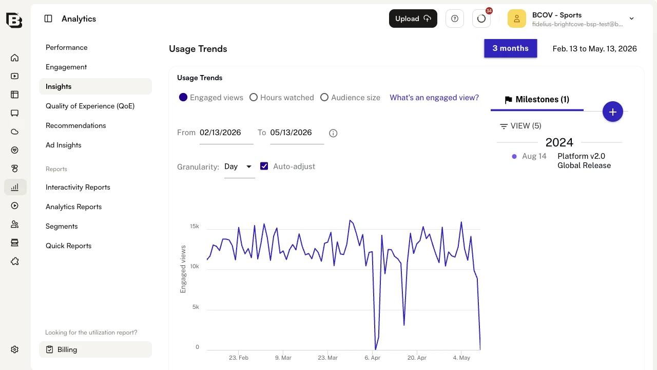
The data shown is for the date range set on the page-level range chip, but the per-chart From / To / Granularity controls above the chart let you narrow into a smaller window without affecting the other insights.
Milestones
Milestones appear in a side panel to the right of the Usage Trends, Sessions Over Time, and Content Trends charts. Each milestone is also drawn as a vertical marker on the corresponding chart, so you can correlate releases, campaigns, and other events with changes in consumption.
To add a new milestone, click the round + button at the top of the Milestones panel. Fill in the date, description, and tag, then save. The new milestone appears on the chart at the selected date.
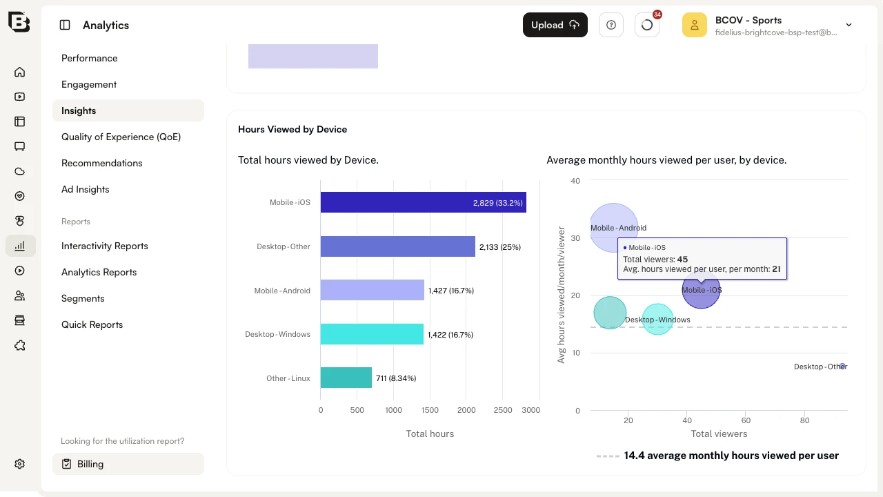
Hours Viewed by Device
The Hours Viewed by Device insight shows how your content is consumed across different device categories.
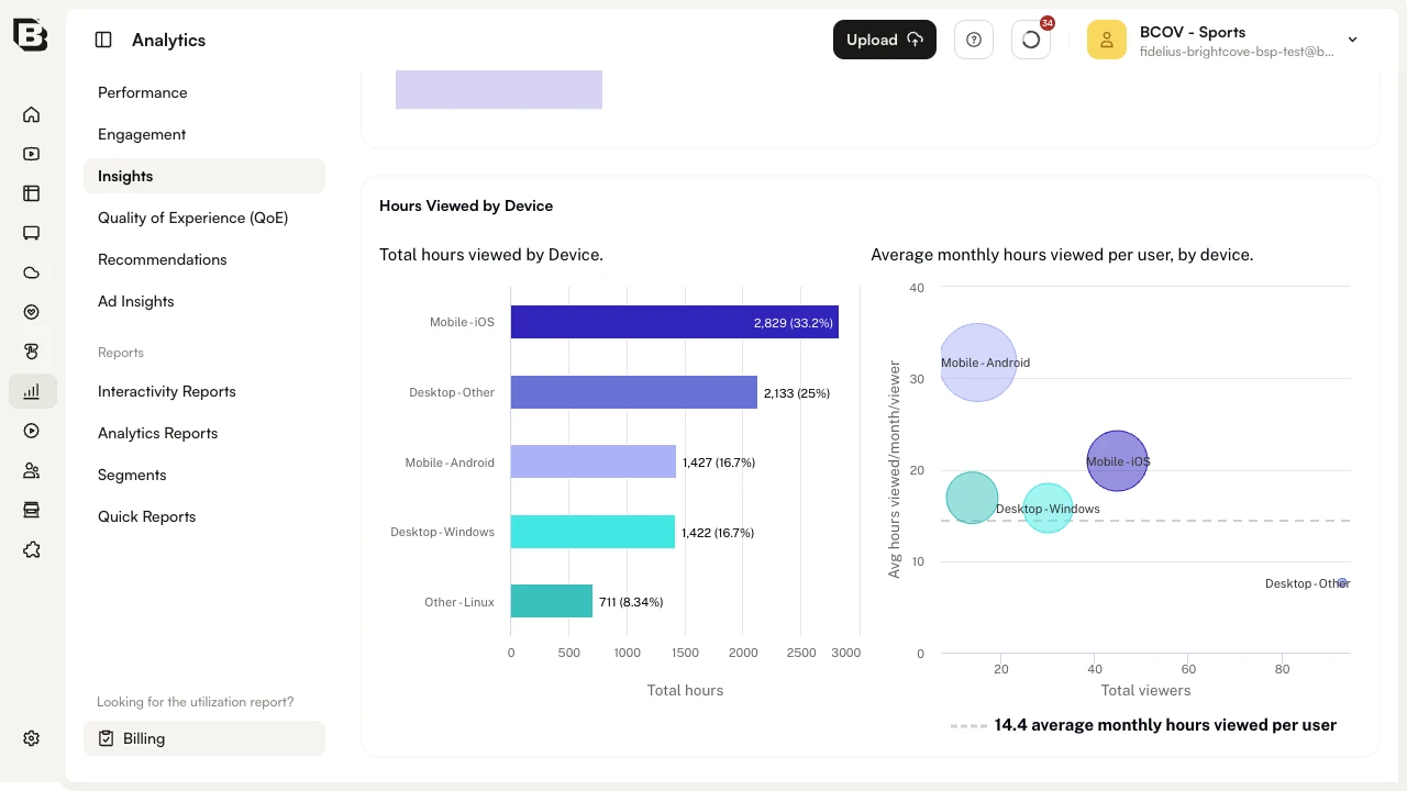
The bar chart on the left ranks devices by total hours viewed (with each bar showing the count and percentage of total). The bubble chart on the right plots Total viewers on the x-axis against Avg hours viewed/month/viewer on the y-axis, so you can spot devices that are over- or under-performing on a per-viewer basis. The horizontal dashed line marks the overall average monthly hours viewed per user.
This is useful for ingest-profile and content-production decisions, ensuring your output is well matched to the devices your audience actually uses.
Mouse over a bubble in the right-hand chart to see the exact viewer count and average hours per month for that device:
Hours Viewed by Location
The Hours Viewed by Location insight shows how your content is performing across the world.
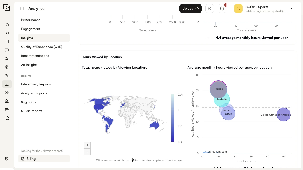
The map on the left colors each country by total hours viewed using the legend on its right (hours scale from 0.01 to 10k). The bubble chart on the right plots Total viewers against Avg hours viewed/month/viewer by country.
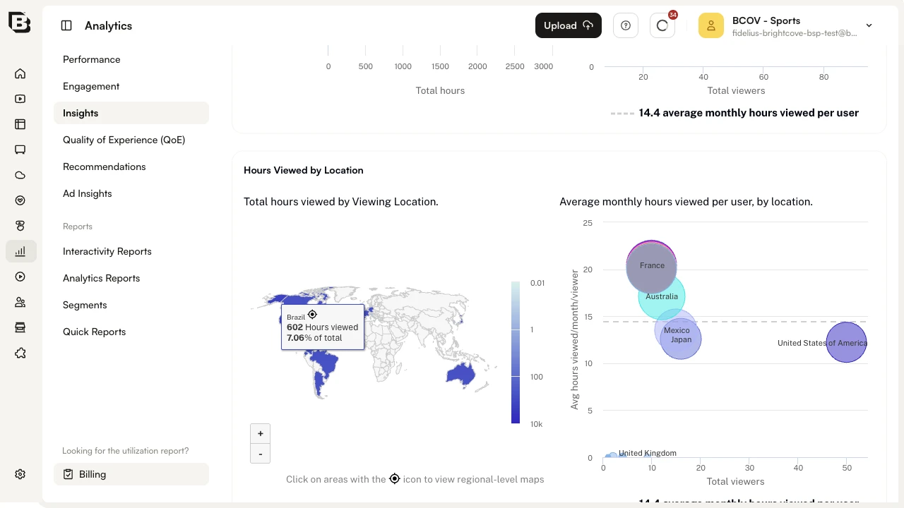
Use the + and - controls in the lower-left of the map to zoom. Hover any country on the map to see total hours and its share of total viewing:
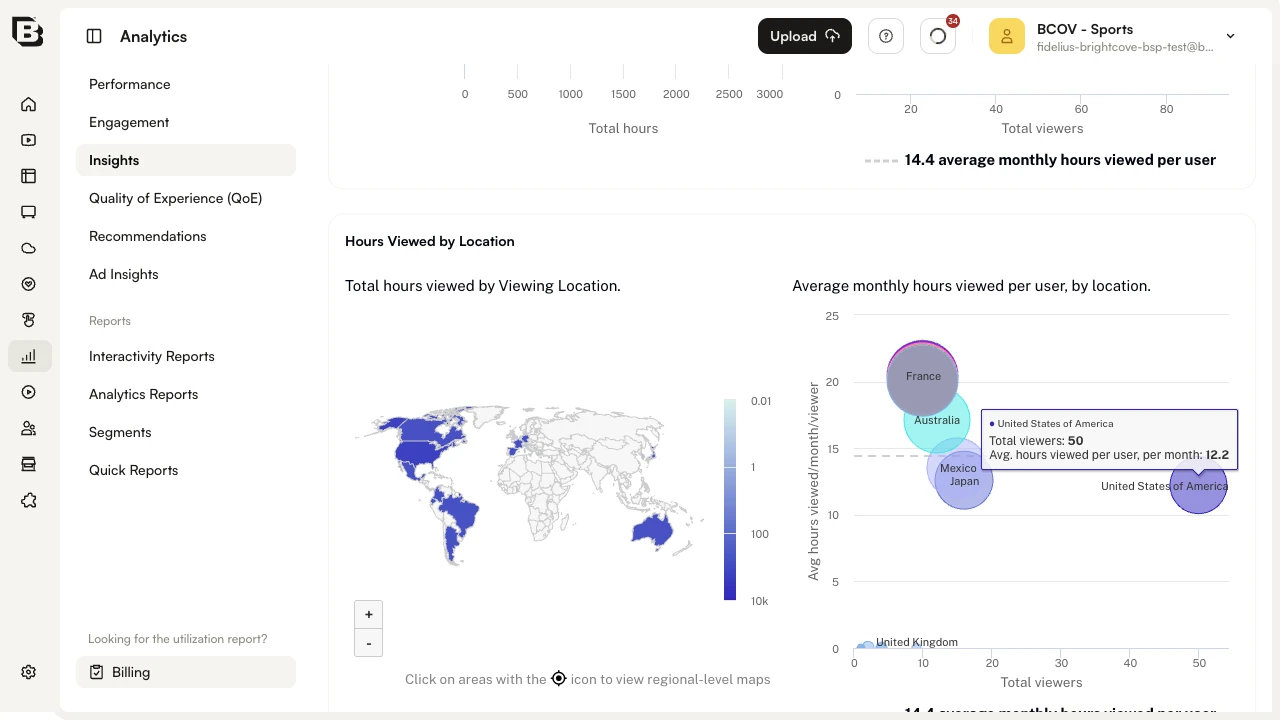
Hover a bubble in the right-hand chart for the same country to see total viewers and average monthly hours per viewer:
Countries that show the crosshair icon in the tooltip can be drilled into. Click such a country on the map to see a region-level breakdown:
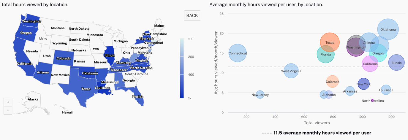
The map and bubble chart both switch to the regional view; hover behavior is the same as for the global view. Click BACK above the bubble chart to return to the world map.
Sessions Over Time
The Sessions Over Time chart plots the number of viewing sessions over the selected period as a stacked area, split into New, Engaged, and Re-engaged viewers. A dotted line overlays the Average duration on the secondary y-axis. Milestones are drawn as markers so you can see how releases or campaigns affected sessions.
Hover the chart to read the value of each series on a specific day. Use the range slider below the chart to focus on a smaller window.
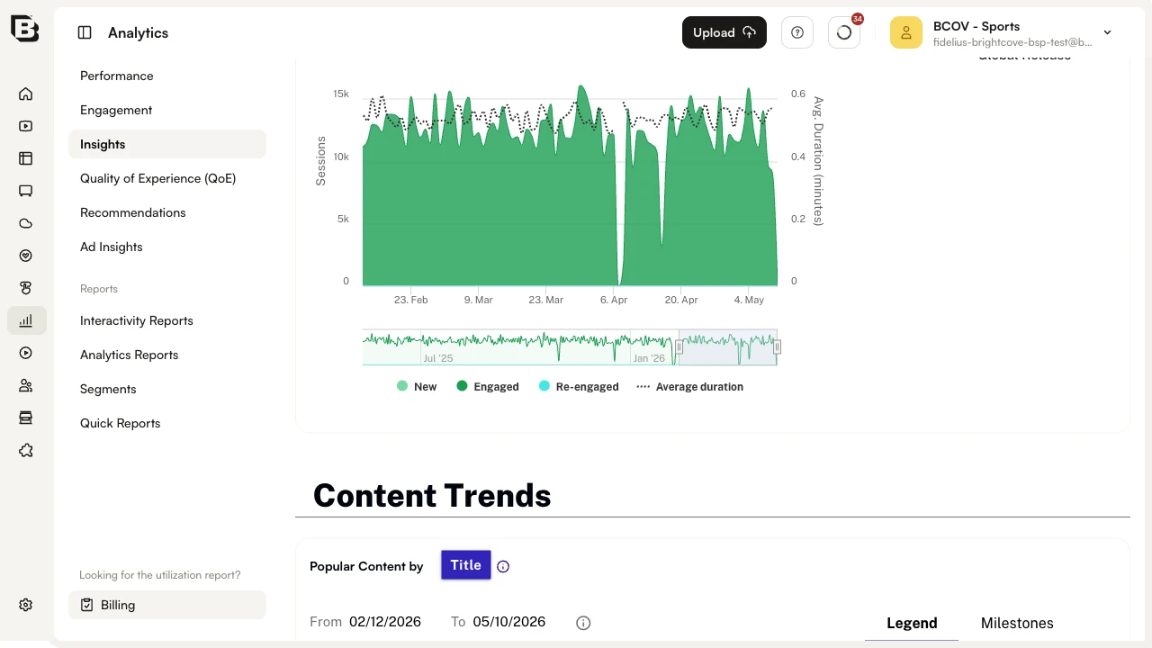
Content Trends
The Content Trends section of Insights provides several ways to see trends across your content library, detailed below.
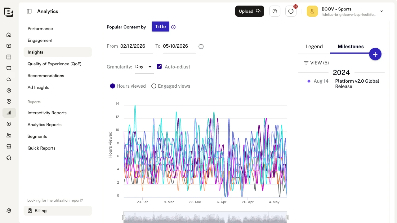
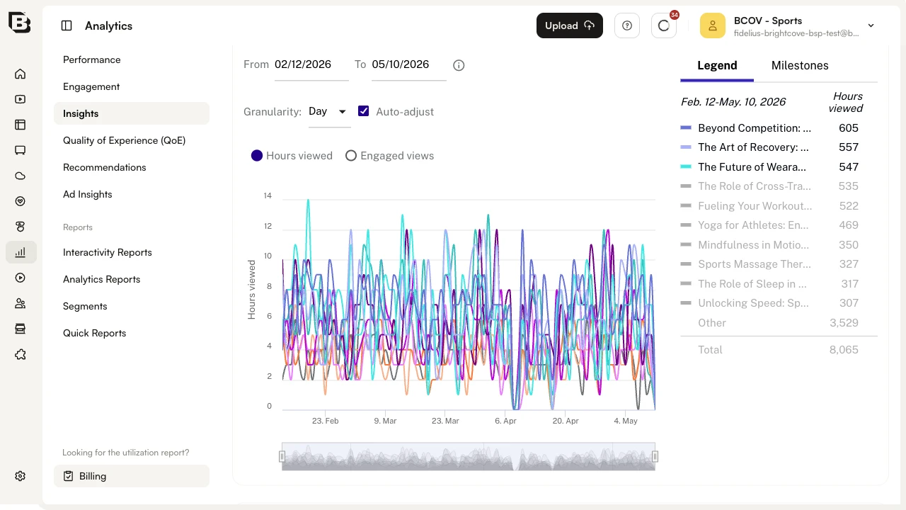
Popular Content
The Popular Content by Title chart ranks your titles by either Hours viewed or Engaged views. Use the radio buttons above the chart to switch metric. The Legend panel on the right lists the top titles for the period; hover a title in the legend to highlight its line in the chart. The From, To, and Granularity controls above the chart let you adjust the per-chart date range.
Below the chart, a row of library-level metric cards summarizes the period:
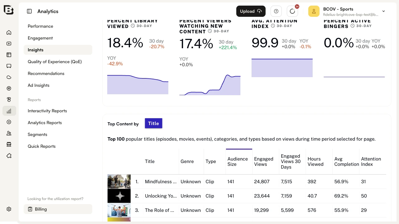
Each card shows the headline value alongside a 30-day mini-chart, the 30-day change versus the previous period, and the year-over-year change. The cards include:
- Percent Library Viewed — the share of distinct titles that received at least one view in the period.
- Percent Viewers Watching New Content — the share of viewers whose sessions included a title released in the last two weeks.
- Avg. Attention Index — the library-wide attention index. It ranges from -100 to 100 and subtracts the share of viewers who watched at least one minute but less than 10% of a video (dissatisfied) from the share that watched at least 75% (satisfied). Negative numbers mean more dissatisfied than satisfied viewers.
- Percent Active Bingers — the share of viewers whose sessions show binge-style consumption behavior.
Top Content
The Top Content by Title table lists the Top 100 popular titles (episodes, movies, events), categories, and types based on views during the selected period. Each row shows the title thumbnail, Genre, Type, Audience Size, Engaged Views, Engaged Views 30 Days, Hours Viewed, Avg Completion, and Attention Index.
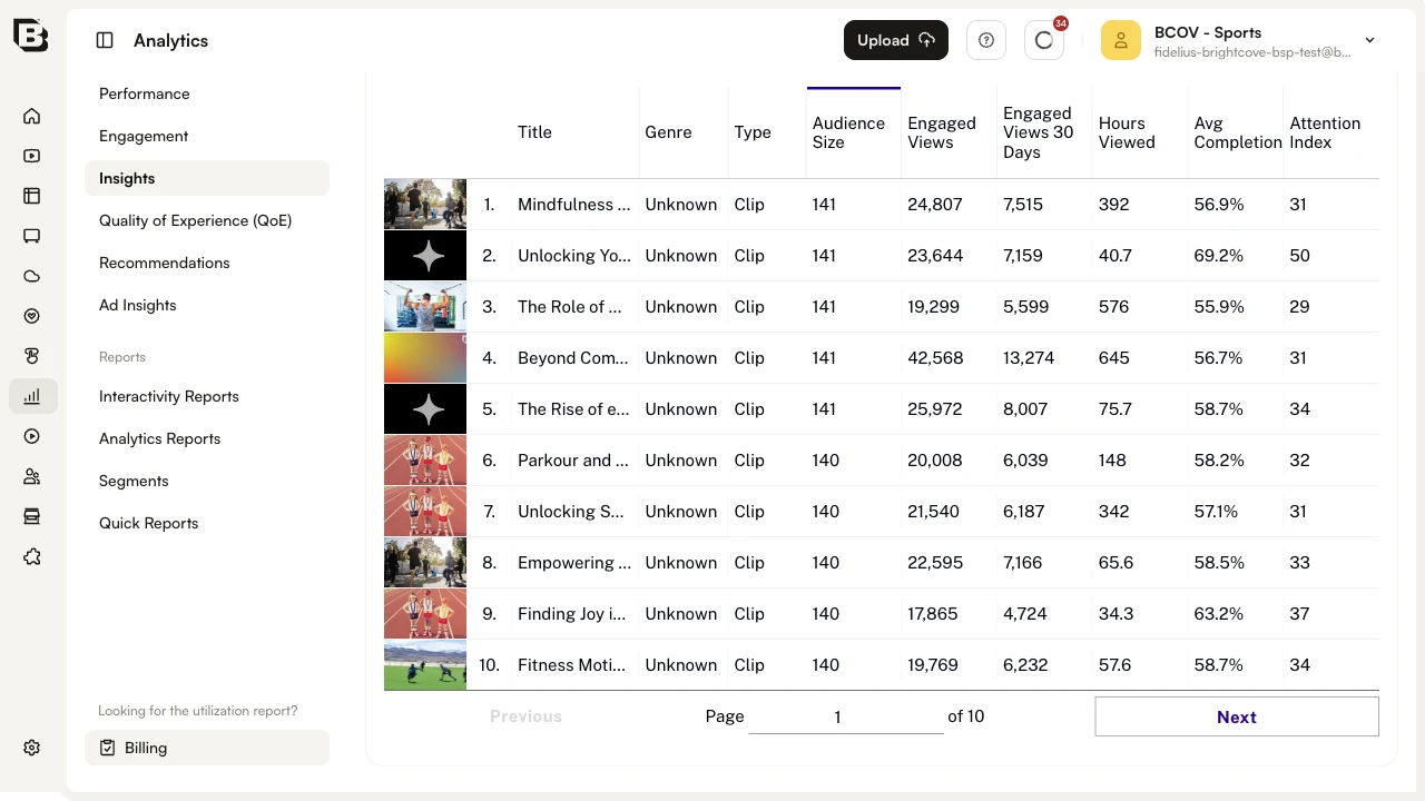
Click any column header to sort the table by that column. Use the pager at the bottom to step through the 10 pages of results.
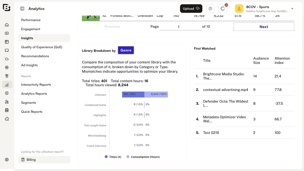
Library Breakdown and First Watched
At the bottom of Content Trends, the Library Breakdown by Genre chart compares the composition of your library (Titles) with the consumption of it (Consumption in Hours), broken down by genre. Mismatches between the two bars indicate opportunities to optimize your library mix. The header also shows Total titles, Total content hours, and Total hours viewed for the period.
The First Watched panel on the right lists the titles that audience members watched first in the period, with their Audience Size and Attention Index — useful for choosing the right starter content to promote to new viewers.